PACKAGING DESIGN | BRAND COMMUNICATION | DIGITAL | SOCIAL MEDIA
The brand is about stone ice-creams and thrives in a cut-throat competitive space. Client felt that the brand needed more to the character and a reckoning identity. They wanted to diversify and establish the brand nationwide with a fresh brand language.
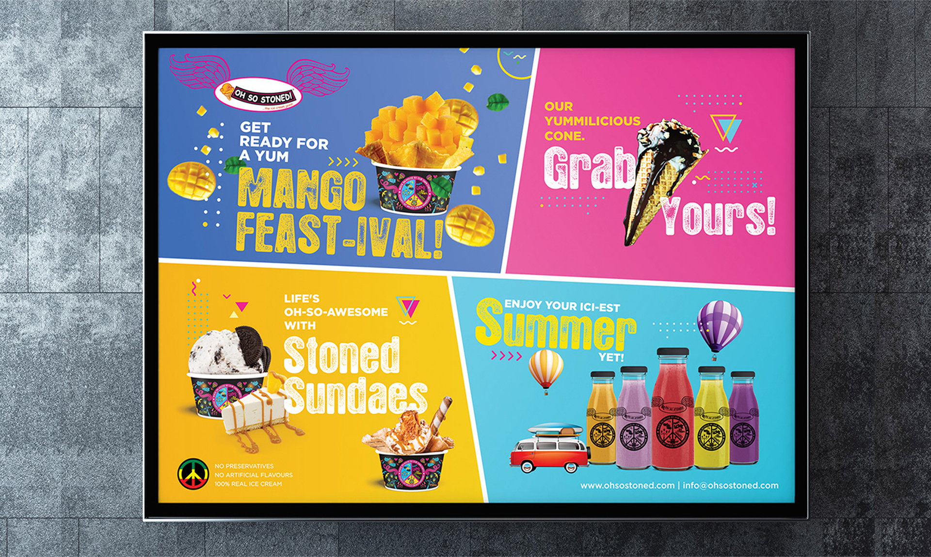
Keeping in mind the retro look and feel of the store, we worked on developing fun, colourful, and vibrant elements to develop the packaging, store touch points and social media communication that aligns with retro personality.

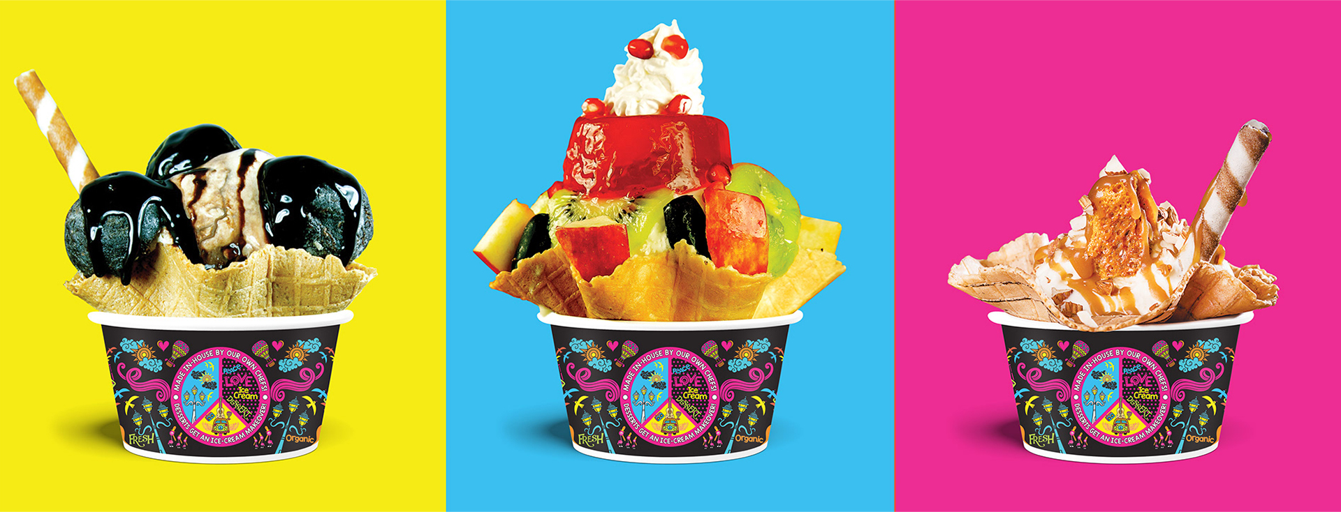

The brand identity we crafted has a classy & modern feel. Retro and colorful design language presents the brand with a classic look. We launched it in the NCR region with a bevy of challenges facing us, including introducing the relatively novel product to the market. Beating all the odds, we made the brand launched to a big buzz via a multi-pronged digital, social, and POP/POS approach. From creating a quirky personality through new packaging to building topical hype to an interactive brand across media, we did everything to grant a unique and engaging identity.
The brand now looks classy and modern exuding vibrant retro vibes and created much buzz making its presence felt across digital, social, and POP/POS approach. We not only carved a quirky brand personality through developing new packaging but we also became successful in building topical hype to help the brand pose as an interactive brand across media. In a nutshell, we executed all essential strategies to grant a unique and engaging identity to the brand.