
REBRANDING | BRAND IDENTITY | BRAND COLLATERAL | PRESENTATION TEMPLATES
The Client wanted to reposition Trilasoft as a decade-old experienced innovation-based IT Company but with a fresh identity. The brief was to upgrade the brand personality just as the technology keeps updating to serve more effectively.
We built Trilasoft’s new brand image from scratch. After obtaining insights into market trends, we
determined a new logo with a new color palette, iconography, and brand guide to help set the tone
for the rest of the branding collaterals.
The Logo signifies the evolution and transformative power of technology similar to living cells. The
usage of logo is on its house colours - Red and Blue. The curved font with round edges in the logo
mirrors company’s flexibility to mould itself as per the need of its customers.
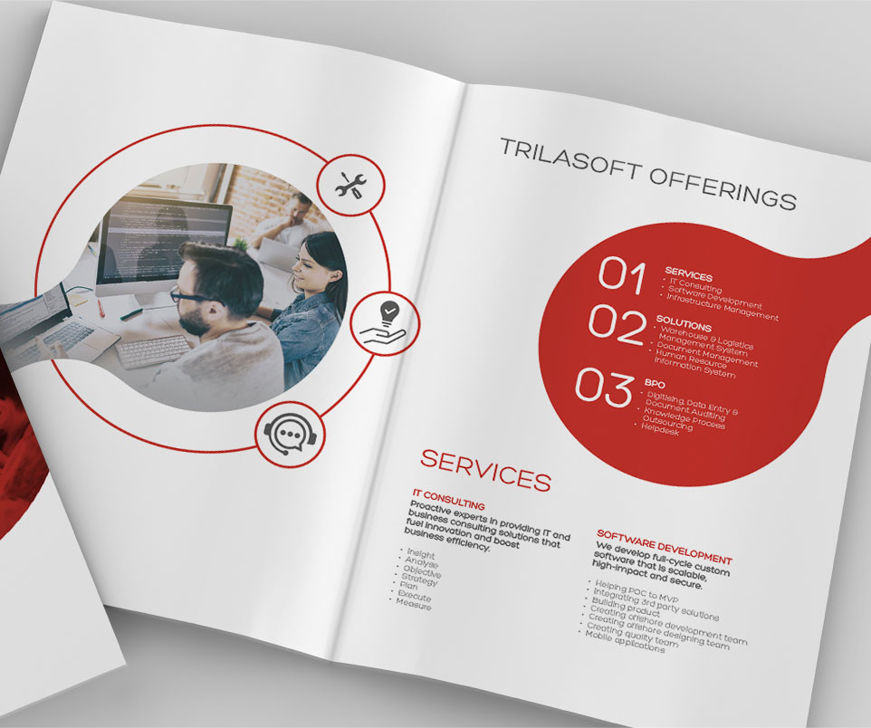
We created the corporate stationery along with their company brochure and some online templates.


We built an attractive, dynamic brand image for the company that their team felt had just the right mix of playful and professional styles they were foreseeing.

